![]()
Back to Works Page
visit website
JurInnov
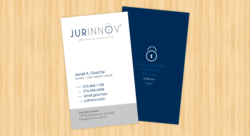
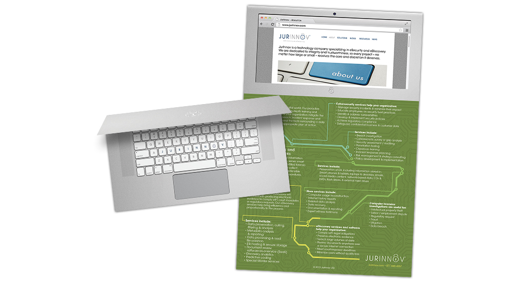
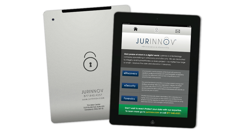
JurInnov is among the top firms in its industry, but the founders recognized that when it came to their existing branding and marketing, there was certainly a lot of catching up to do. Quez Media first worked with JurInnov to redesign their logo, which was simply an outdated type treatment cast in pastel colors that would have been best suited for a cupcake company. Quez modernized the type treatment, opting for a sleek, thin typeface colored in a more industry appropriate blue + gray combination. An abstract lock icon was added to the name to visually represent the company, which is reinforced by the introduction of an all-new tagline that perfectly sums up the wide range of otherwise overwhelming services. The lock can be taken either as open, or locked, representing eDiscovery, or eRecovery, respectively. The marketing materials were rewritten, simplified, and given a more creative touch than a simple tri-fold. The brochure stands alone as a laptop computer with the detailed services listed in the circuitry inside the keyboard. The complementing flyer is a simple one-pager, but designed to resemble a tablet.
